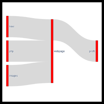
Sankey diagrams are nice. Plotly is also nice, but at least for me it was a little challenging to understand how it is used as the documentation is not very user friendly especially if you want to position labels yourself. Below is a "beautiful" example of a Sankey diagram. It depicts the beer cycle. The color scheme was chosen just for demonstration purposes. The purpose of this page is to show how you can force Plotly to put labels where you want them to be placed and how to specify colors for each connection.
Labels
I reckon the easiest way to prepare data is to use Libreoffice/Excel ([a href="beer.ods"]example[/a]) and to create two sheets: the first one contains a legend (the python script at the end of the page assumes it is named "Legend") that maps human readable names such as "beer" to indeces used by Plotly. The gotcha here is, at least for those that don't think like programmers, that the index numbering starts from 0 instead of 1. This is also the place where you specify label positions. The numbering scheme runs from 0.01 to 1 as far as I know. Clipping of flows may occur if your labels are too close to the edges.
| Labels | Index | X | Y |
|---|---|---|---|
| Water | 0 | 0.1 | 0.2 |
| Hops | 1 | 0.1 | 0.5 |
| Wort | 2 | 0.2 | 0.2 |
| Yeast | 3 | 0.2 | 0.5 |
| Beer | 4 | 0.33 | 0.2 |
| Other Energy | 5 | 0.33 | 0.5 |
| Me | 6 | 0.5 | 0.2 |
| Wastewater treatment plant | 7 | 0.8 | 0.2 |
| CO2 | 8 | 0.8 | 0.5 |
| Atmosphere | 9 | 0.95 | 0.5 |
| Compost | 10 | 0.95 | 0.2 |
Connections
Name the second sheet "Connections" and describe connections between labels. The easiest way is to use human readable labels and then use the vlookup fuction to pull indices for these labels from the Legend sheet. Thickness is the thickness of the flow line and color specifies its color in "red, green, blue, transparency" format where the color range is 0...255 and transparency 0...1 where 0 is transparent and 1 is solid. It is a good idea to use some transparency as flow lines often overlap.
| FromText | ToText | From | To | Thickness | Color |
|---|---|---|---|---|---|
| Water | Wort | 0 | 2 | 1 | rgba(51,195,225,0.9) |
| Hops | Wort | 1 | 2 | 1 | rgba(12,49,7,0.9) |
| Wort | Beer | 2 | 4 | 2 | rgba(142,96,29,0.9) |
| Yeast | Beer | 3 | 4 | 1 | rgba(61,195,223,0.9) |
| Beer | Me | 4 | 6 | 3 | rgba(97,235,185,0.9) |
| Other energy | Me | 5 | 6 | 1 | rgba(251,177,202,0.9) |
| Me | CO2 | 6 | 8 | 1 | rgba(49,85,228,0.9) |
| Me | Wastewater treatment plant | 6 | 7 | 3 | rgba(75,188,156,0.9) |
| CO2 | Atmosphere | 8 | 9 | 1 | rgba(162,20,173,0.9) |
| Atmosphere | Other energy | 9 | 5 | 1 | rgba(205,115,240,0.9) |
| Wastewater treatment plant | Water | 7 | 0 | 1 | rgba(131,234,185,0.9) |
| Atmosphere | Hops | 9 | 1 | 1 | rgba(153,30,254,0.9) |
| Wastewater treatment plant | Atmosphere | 7 | 9 | 1 | rgba(17,42,17,0.9) |
| Wastewater treatment plant | Compost | 7 | 10 | 1 | rgba(147,4,195,0.9) |
| Compost | Hops | 10 | 1 | 1 | rgba(76,159,47,0.9) |
| Wastewater treatment plant | Hops | 7 | 1 | 1 | rgba(234,173,63,0.9) |
Code
The python script below pulls data from and .ods file (Libreoffice) from sheets "Legend" and "Connections" and spits out a Sankey diagram similar to that on the top of this page. The script requires plotly, pandas and pandas_ods_reader modules. All of these can be installed using pip.
import plotly.graph_objects as go
import pandas as pd
from pandas_ods_reader import read_ods


path = "/path/to/your/sourcefile.ods"

label_sheet = "Legend"

connections = "Connections"

df_labels = read_ods(path, label_sheet)
df_connections = read_ods(path, connections)


convert_dict = {'From': int,
                'To': int,
                'Thickness': int }

df = df_connections.astype(convert_dict)

labels = df_labels["Labels"].values.tolist()

source = df["From"].values.tolist()
target = df["To"].values.tolist()
color = df["Color"].values.tolist()
value = df["Thickness"].values.tolist()

link = dict(source=source, target=target, value=value, color=color)
node = dict(label=labels, pad=15, thickness=1, color="red", x=df_labels["X"].values.tolist(), y=df_labels["Y"].values.tolist())

fig = go.Figure(data=[go.Sankey(arrangement='fixed', link=link, node=node)])

fig.show()